CB Graph
Types of graphs - examples
Create graphs
In the list view
- Before a graph can be integrated into the page, it must first be created. This is only possible via the list view.
- In the list view, there is a plus "+" at the top, which adds new content to the page.
- A list opens with all possible content. The graph must be selected there.
- The settings menu for all chart types opens. It is advisable to select the chart type before editing all fields. The fields differ depending on the type. More detailed information on all chart types can be found below.
- Once all fields have been filled in, the graph can be saved. The graph is now created.
Insert graphs
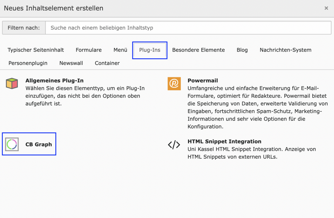
- A new element can now be inserted in the page view via + Content.
CB Graphs can be found under the Plug-In tab.
The heading (including type) and a link can now be inserted via the General tab.
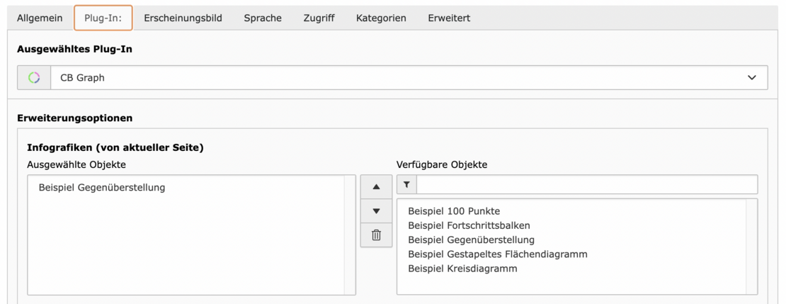
The graph is now inserted in the Plug-In tab. There is a list of available objects on the right under Advanced options. The previously created graph should also appear there. The selected graph appears after selection on the left-hand side under Selected objects.
Comparison
Studierende Wintersemester 2021
Pie chart
Studierende Wintersemester 2021
100 points
Studierende Wintersemester 2021
Progress bar
Studierende Wintersemester 2021
Stacked area diagram
Studiengänge (nur Hauptfach) 2021


